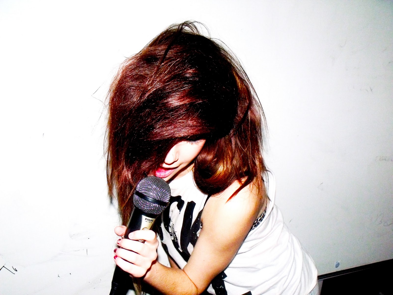
I added a slanted subtitle to attract readers and my black on yellow colour pallet is strong and stands out but it doesn't make the reader eyesore. I didn't want to swear in my music magazine so i used 'duck' instead of a more rude word. I added an image with a yellow border so it would match the colour pallet and it goes nicely with the yellow background of 'INK'
 I also added a large name with a black backround to help create a yellow, black, yellow pattern as to keep the theme of the magazine flowing in the right direction. Adding more slanted text and quotes made it look like a more official music magainze and the slanted text also went well with the slanted text lower down the front cover page.
 I made sure i kept the colour pattern working as not to create a bad vibe for the reader. I didn't want to do and more slanted text as it would end up looking like it had been printed wrong. I also did another box telling the reader that there are also 'behind the scenes' articles and pictures to draw the reader in much more so that they would want to buy the magazine.
 I made the musice magazine look more appealing by making it a 'special issue'. This would hopefully make the reader feel like they are buying something rare and that it will be worth the time for them to read and cherish the magazine. i also made the magazine seem more exclusive by using slanted text which said 'IN THE RAW' which will make the reader believe they will be reading the truth about this person.
 I finished off my front cover of my music magazine by adding two photographs either side of the bottom of the magazine to even out the creative flow of the cover. I overlapped the slanted text with the pictures as it is what kerrang magazine normally does as well as NME magazine, which i thought made my magazine more realistic.
CONTENTS
 I used a black background as the front cover had a balck and yellow theme to it so i thought i should keep the theme going so it would look like it was part of the magazine instead of it looking like a completely different magazine. I used a photograph and enlarged it to show what the main story of the music magazine is about. The yellow bar if to show where i will put what will be in next weeks issue.
 After doing this i decided to add another photograph to give the contents of my music magazine a better visual effect. I also added an issue date in white to show or made it seem like it was an official magazine. I then began to add the page numbers and a bit more information about what is happening in each page, whilst still keeping to a black and yellow theme and using the white for a bit of a change.
 I then added a large, made-up quote and highlighted it in yellow for a better 'wow' factor. I added more text about how to join and win a competition and also some subheadings to my contents page so that the reader is able to work through the music magazine more easily as the contents is very organised and i think it still looks like a really good music magazine.
 I then completed the actual contents layout which was along th right hand side of the page. I then added more information on the largest picture and gave the text a yellow background so that it contrasts with the black contents page background. On the largest image I though that having a black number on a yellow background wouldnt stand out well so I swapped the colours around.
 I wasn't really as happy as i could be with the look of my music magazine contents page so i swapped a few pictures around eg. the top left image and the top right image. I also added more text thanking the readers for buying this magazine so that they feel more welcome to getting this magazine again.
DOUBLE PAGE ARTICLE

The image i used was a little blurry but i thought that it still would look good as the background for my double page article. I also added a sub-heading on a yellow background so it looked like part of the same magazine. I didn't extend the photograph the full of the double page but that was because i was expecting to put more pictures and textboxes on the page.
 After being satisfied with the look of my page so far I decided to give it a bit more flare by adding a title in an old, rock type font in yellow also to contrast with the background but also to blend in with the yellow. The i added a large black textbox and changed the colour of the font to yellow. which i thought looked pretty good as it matched with the other pages.
 Then i added a small yellow textbox with black writing. The reason why I made the textbox so small was that i only wanted my text to go over so far like a paragraph. After that i added a page number on a black background to contrast and stand out against the yellow textbox. After that i used opposite coloured arrows to show where the begining of each side of the interview starts.
 I then added another two yellow textboxs to try and complete the interview taking place and i really was proud of the work and the overall magazine which was begining to come together in one creative black and yellow blast. However i could clearly tell that something was missing in bothe the bottom right and the top left corners but i was unsure what to put there which would look good.
 I decided to place two band like images at the bottom right. One photography i kept in a firm solid outline but the other i decided that i wanted that photograph to overlap the other in a rough and rugged way. This i thought was really pulling to magazine together and my creativity just started to thrive more. Sadly i was still unsure what to put in the top left corner of the music magazine.
Finally I decided that the background image was too blurry and not rocky enough for my music magazine so i replaced that. I also added a slanted textbox in the centre on the page on which i added a quote inside. I added another page number as i remembered it was a double page and not a single page. In the top left corner i created another little competition and after that my music magazine front cover, contents page and doub;e page spread was finally complete.